Scope
Creation of a complete visual identity system, including brand renaming, logo design, typography selection, and color palette development.
Role
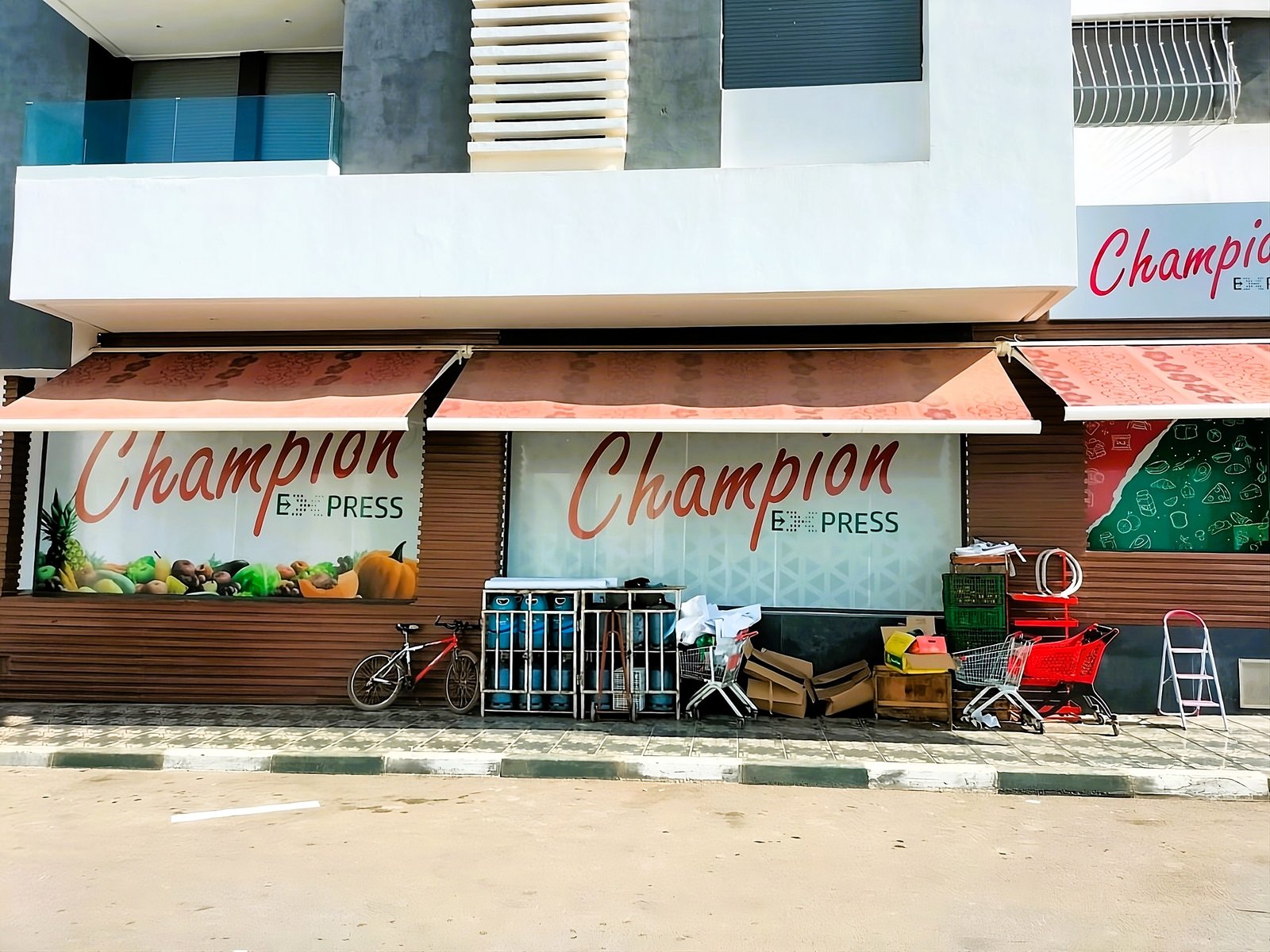
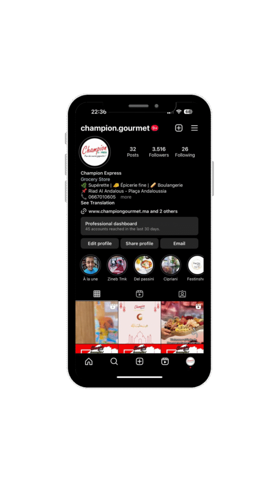
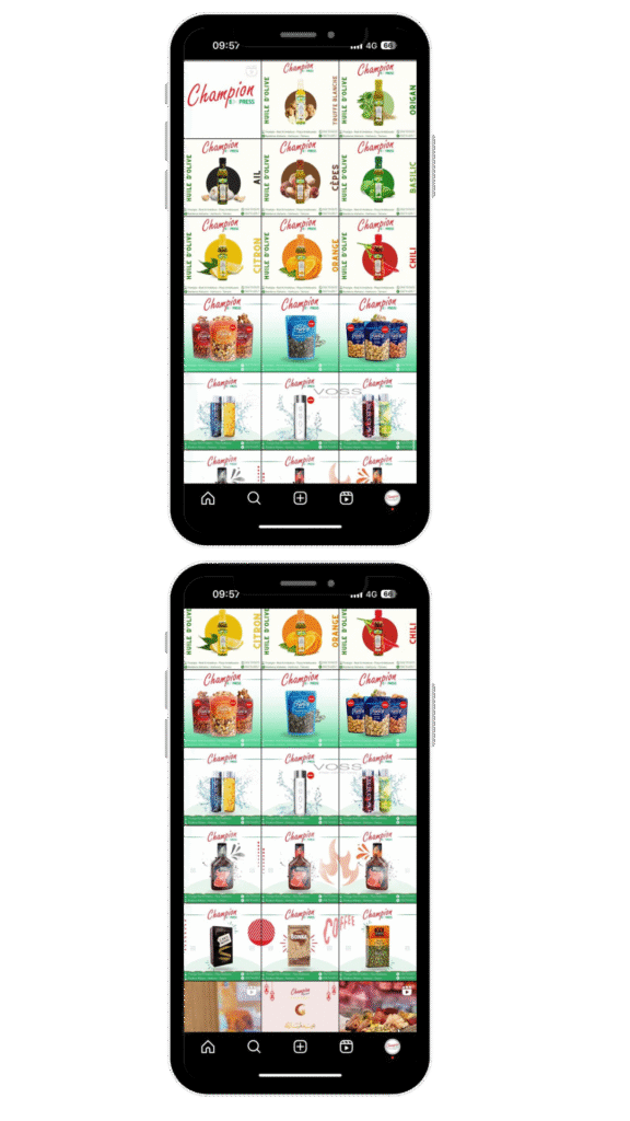
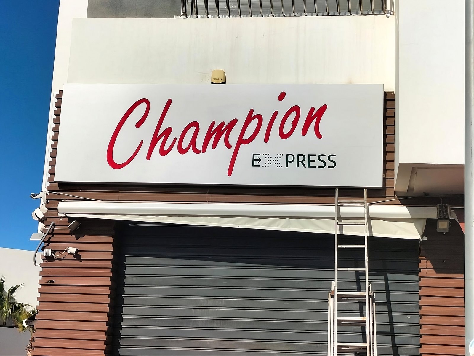
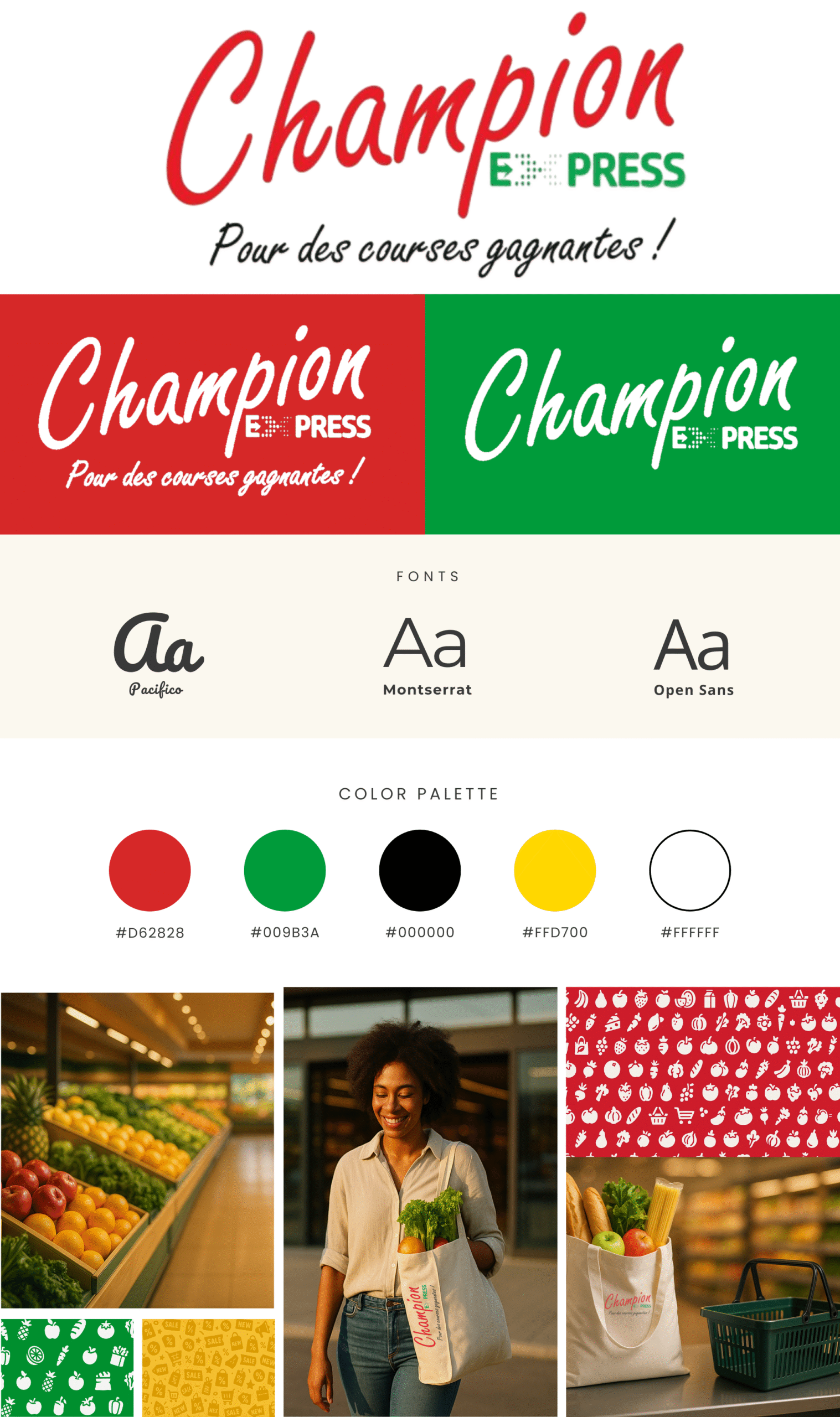
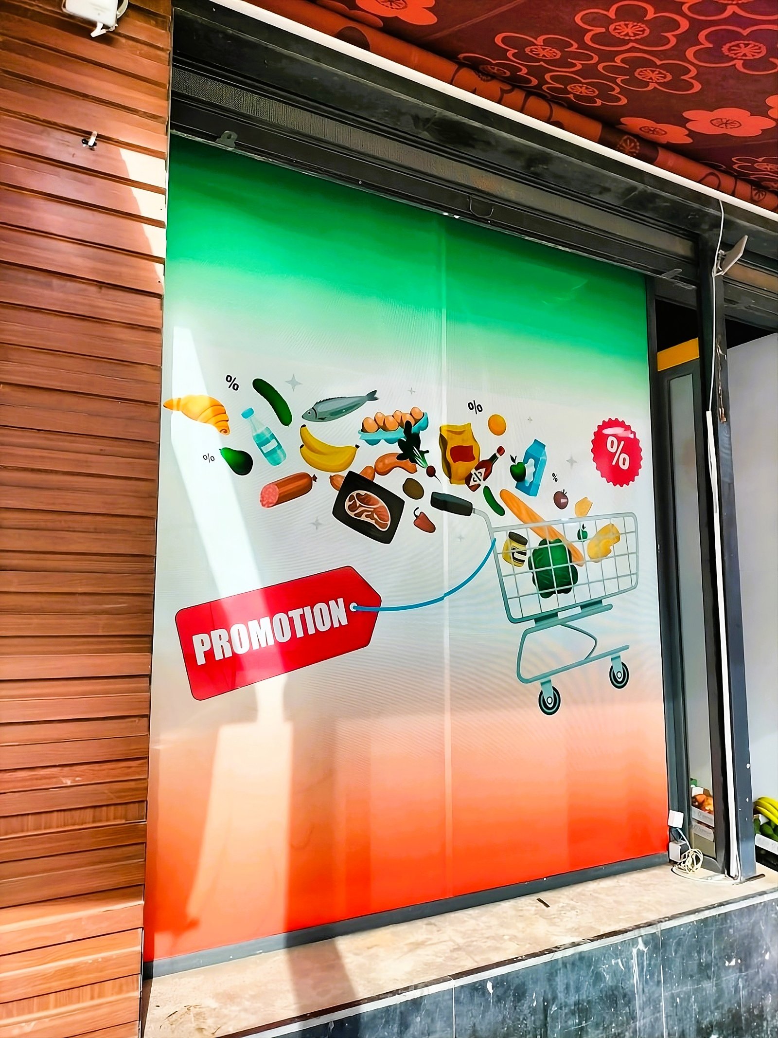
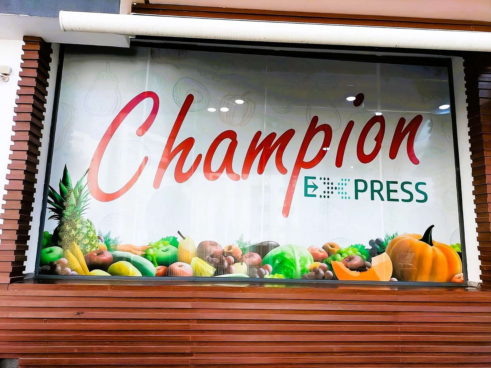
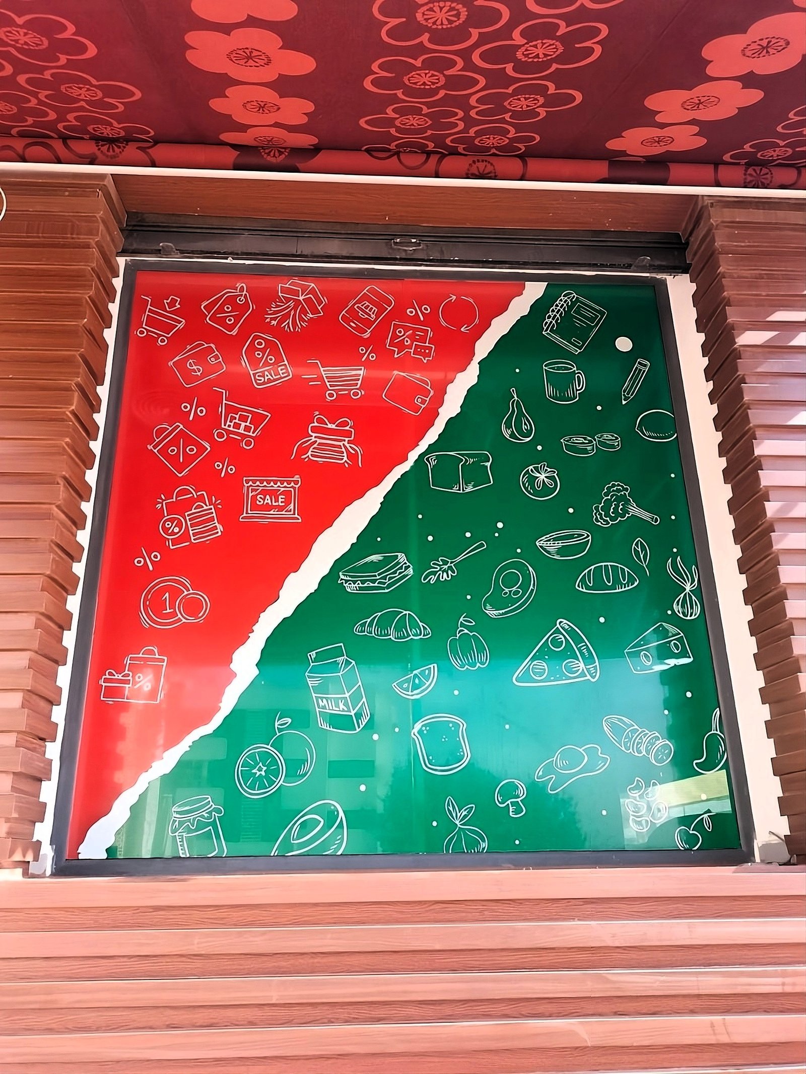
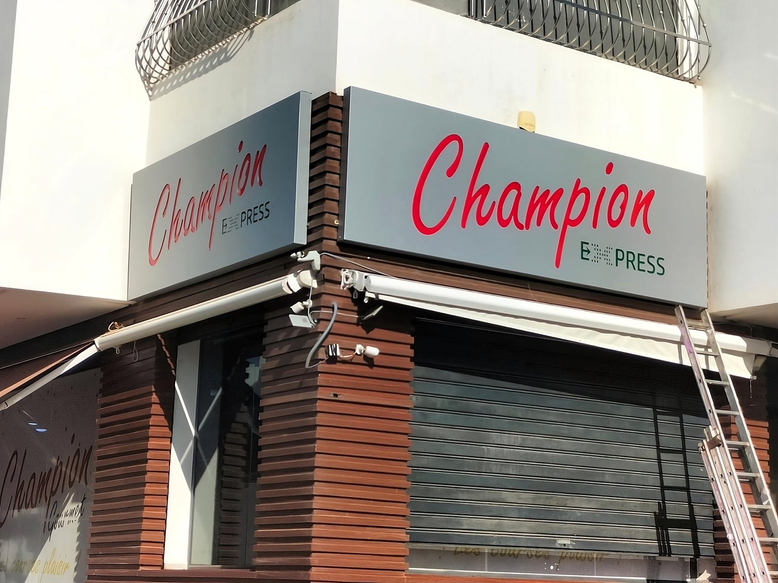
Defined the brand personality and built a cohesive identity board to ensure consistency across all touchpoints. The board guided logo applications, in-store visuals, and packaging ideas.
Concept
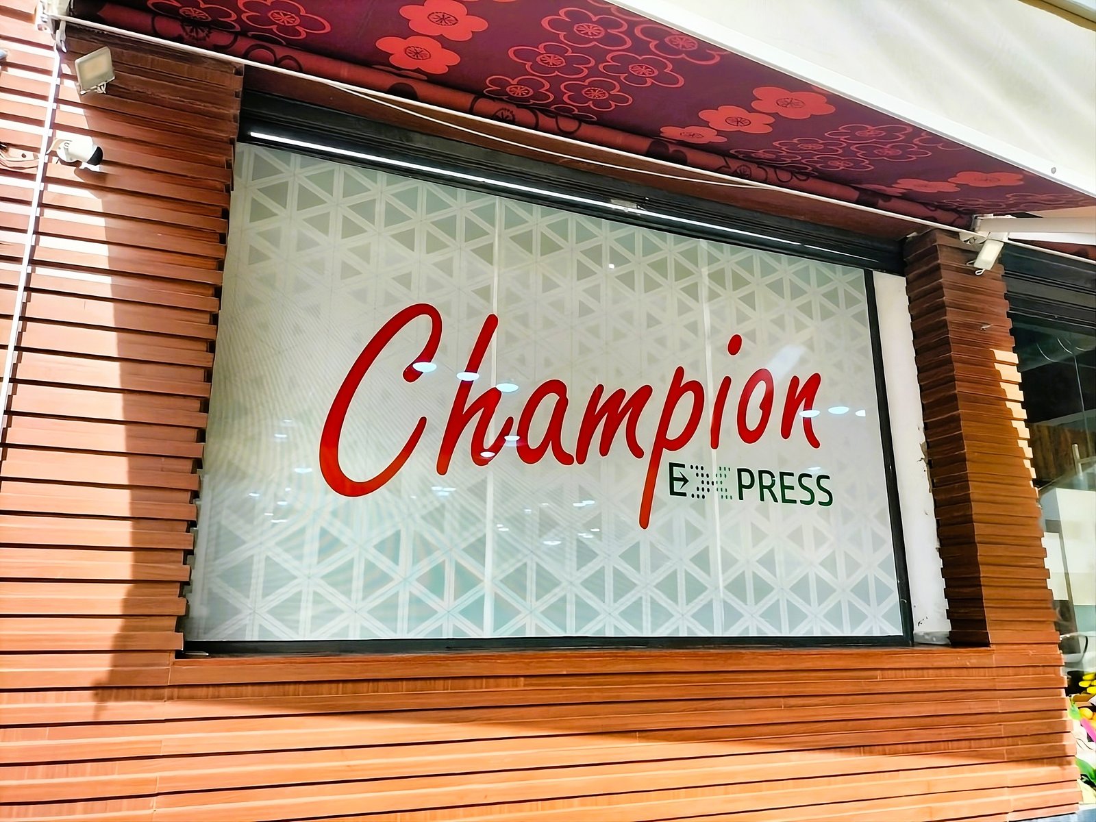
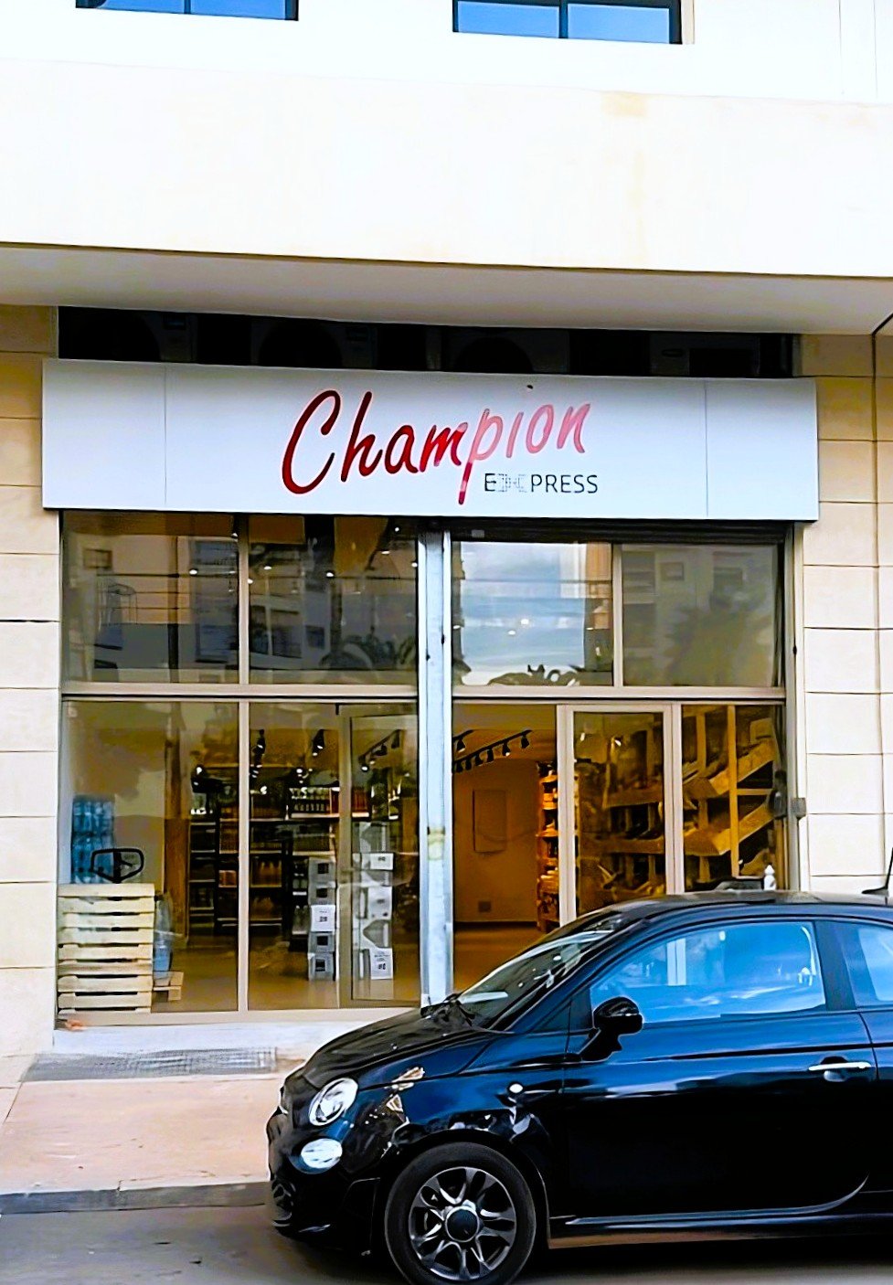
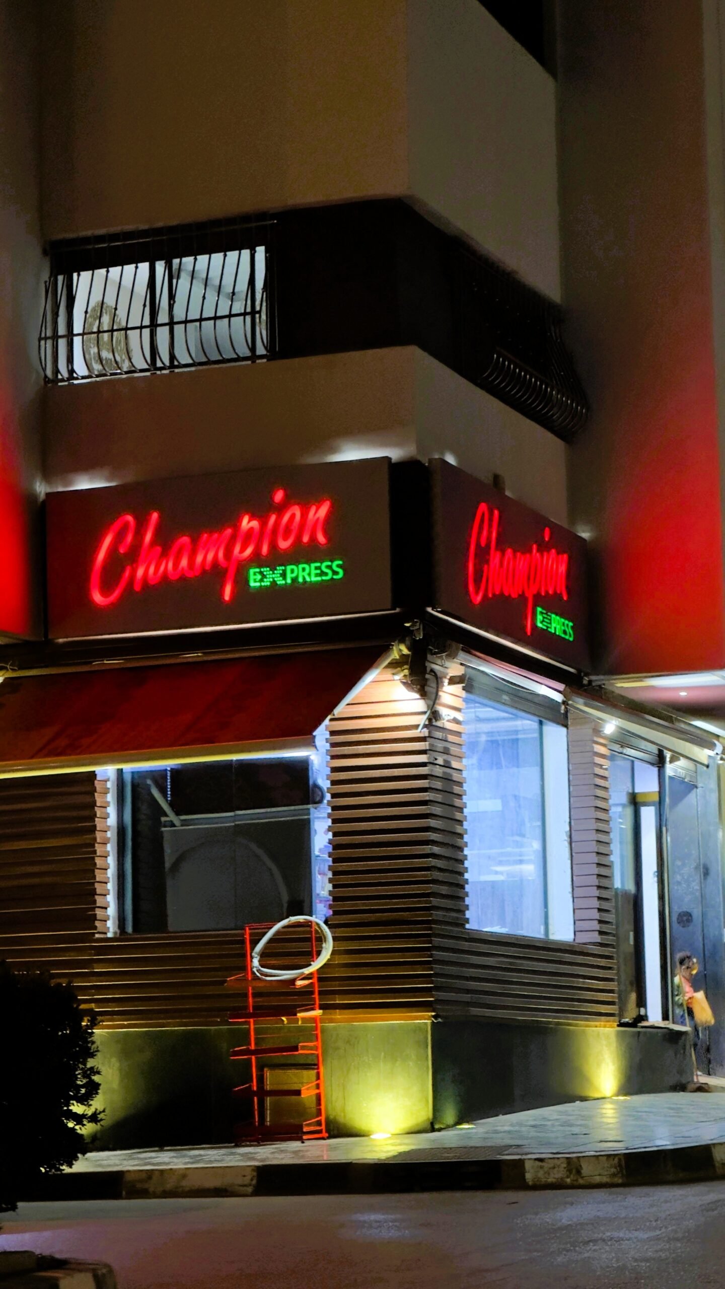
The identity blends freshness, energy, and accessibility, using vibrant colors inspired by markets and everyday groceries. The red emphasizes vitality, green represents freshness, yellow highlights promotions, while black and white bring balance. Paired fonts (Pacifico, Montserrat, Open Sans) combine friendliness with modern clarity.
Palette
#D62828, #009B3A, #FFD700, #000000, #FFFFFF